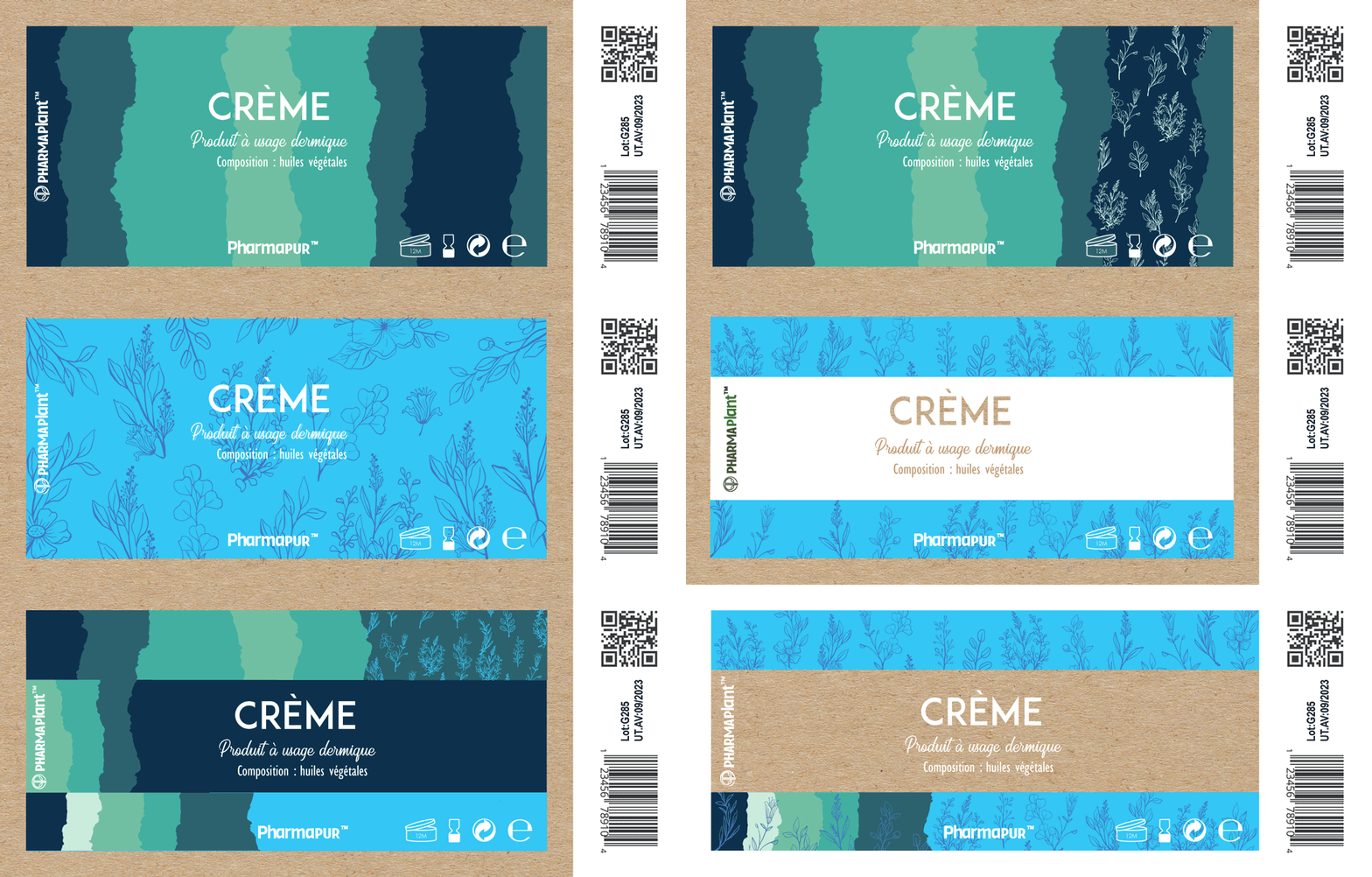
PharmaPlant™ is the tunisian distributor of PharmaPur™, a brand that produces dermopharmaceutical products based on ointments and natural extracts. The challenge was to create a visual identity that is appealing and evokes the homeopatic properties that comes from pure natural extracts.

Challenge
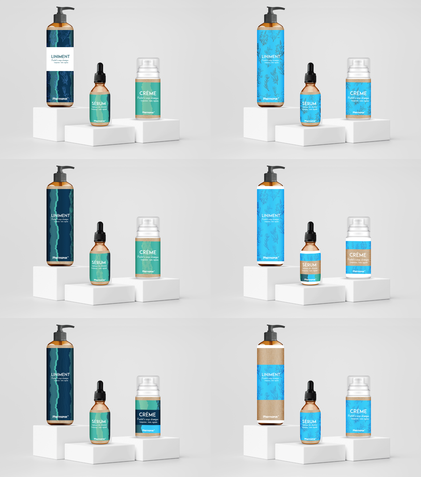
The dermopharmaceutical category is often dominated by highly clinical and standardized visual systems, leading to low differentiation across brands.
Two key challenges were identified:
- Low differentiation in a saturated pharma market, where most products rely on similar medical visual codes
- Lack of emotional connection with consumers, as branding tends to feel distant, technical, and overly clinical
PharmaPur needed a system that could bridge medical credibility and natural wellness perception.
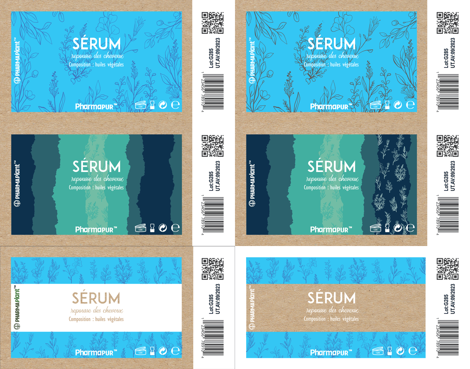
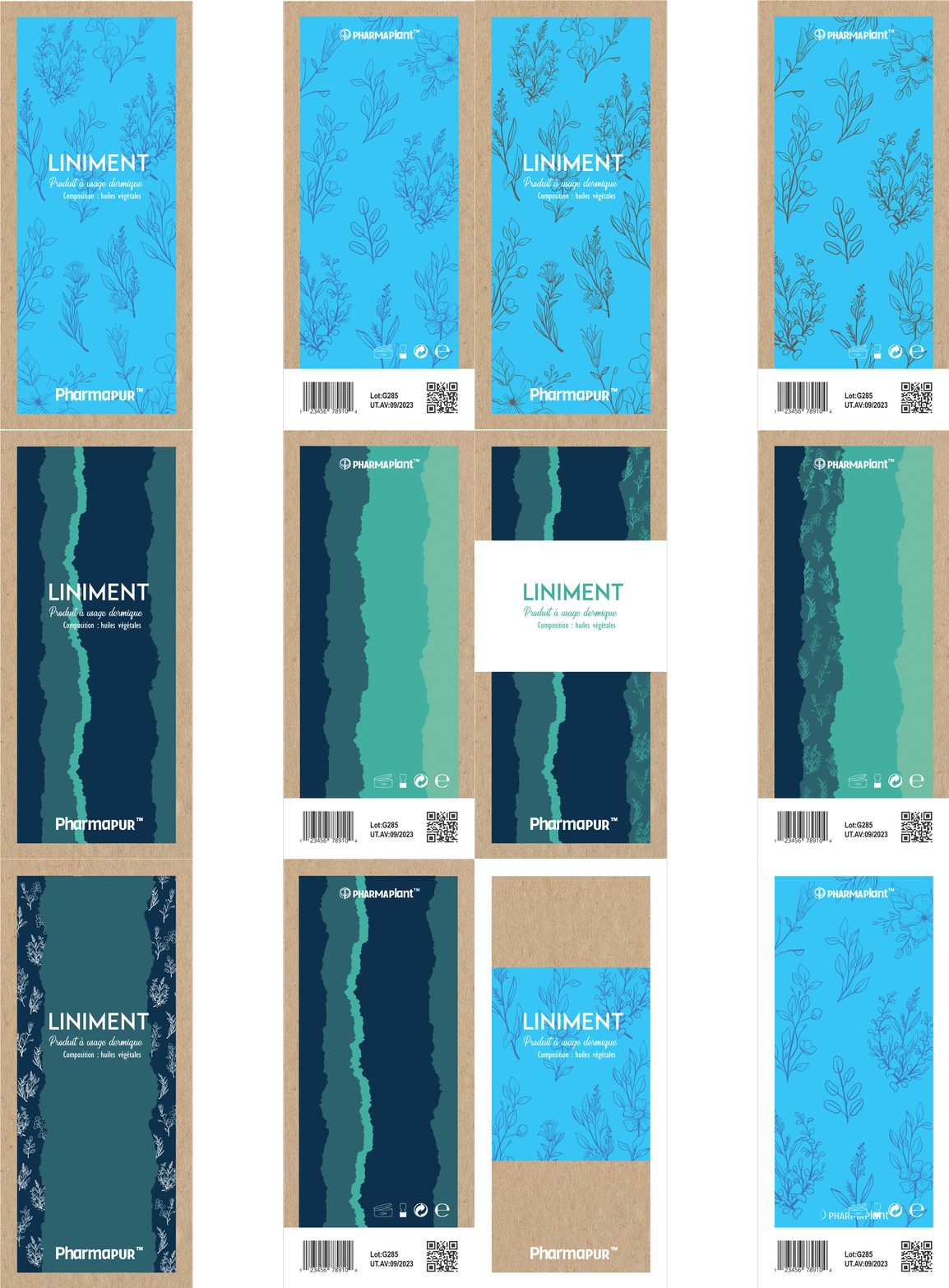
Research Phase
To better understand user expectations and market positioning, a research phase was conducted combining qualitative and competitive analysis.
Tools used:
- User interviews (pharmacists and end consumers)
- Competitor benchmarking across dermo-cosmetic and pharmaceutical brands
- Persona creation to identify motivations, fears, and decision-making factors
The goal was to understand how consumers perceive “natural” versus “medical” branding in healthcare products, and where trust is built or lost.
Insights
The research highlighted three core expectations shaping purchasing decisions:
- Trust → users rely heavily on perceived scientific credibility and clarity
- Simplicity → packaging must be immediately understandable in a pharmacy context
- Transparency → clear communication of ingredients and benefits is essential
A key tension emerged between two perceptions:
Consumers associate medical branding with trust, but natural cues with emotional reassurance.
Strategy
The strategic direction focused on merging both worlds into a unified positioning.
Brand positioning:
An accessible and trustworthy healthcare brand rooted in natural care
Tone of voice:
- Educational → clear, informative, structured communication
- Reassuring → calm, confident, and supportive language
The goal was to create a system that feels clinically reliable yet naturally soothing.
Branding
A visual identity was developed to balance medical structure with organic softness, using:
- Clean and systematic layouts to ensure clarity and trust
- Subtle organic references to reinforce natural origins
- A restrained aesthetic to maintain pharmaceutical credibility
If We Could Do Things Differently
We would extend the research phase to include in-context testing in pharmacies in order to better measure shelf visibility, consumer hesitation points, and trust perception at the moment of purchase.
Prev Post